VISC 204 Studio | Project 1 | Project 2 | Project 3 | Project 4 | Resources


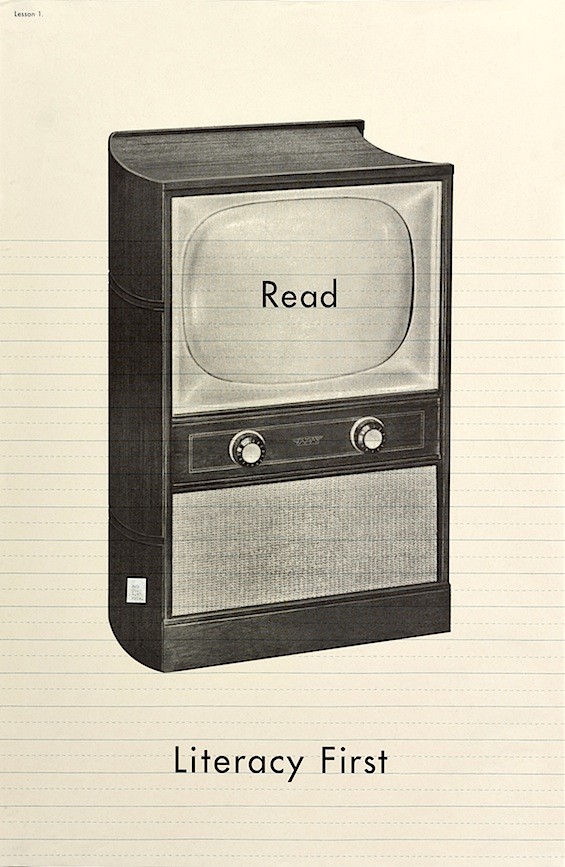
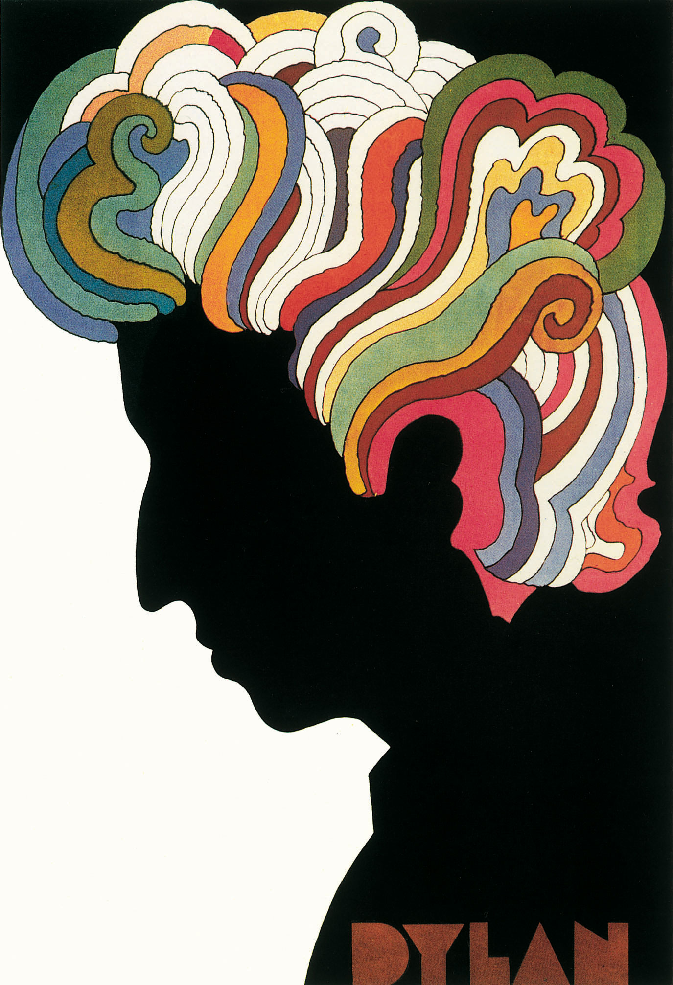


As a medium of communication, the poster has a long history and a wide range of social functions, from selling a product to promoting a cause. Despite digital media, the print poster remains a vital and oftentimes radical form of visual communication. — Cooper Hewitt Design Museum
Posters are a powerful medium of visual expression, especially when serving purposes of advocacy, education and consciousness-raising. As physical objects, they take up public space, arrest the eye, and demand the attention of passersby. Circulated and hashtagged on social media, posters, fliers and waysides carry their messages far beyond the intended or local audience and become important tools for teaching, voicing support, raising awareness, and making the invisible visible.
ASSIGNMENT
Your challenge is to visualize two of the seven Leave No Trace principles and create a 18in x 24in poster for each of the principles your choose. The Seven Principles of Leave No Trace provide an easily understood framework of minimum impact practices for anyone visiting the outdoors.
MUST HAVES
Your poster design must accomodate the principle in text form (needs to be legible) and the LNT logo and url.
These principles (watch video) were established by the Leave No Trace Center for Outdoor Ethics, and built on work by the US Forest Service, National Park Service, and Bureau of Land Management in the mid-1980s. Your job is to design two posters that engage and educate a park visitor on the LNT principle(s) you choose.
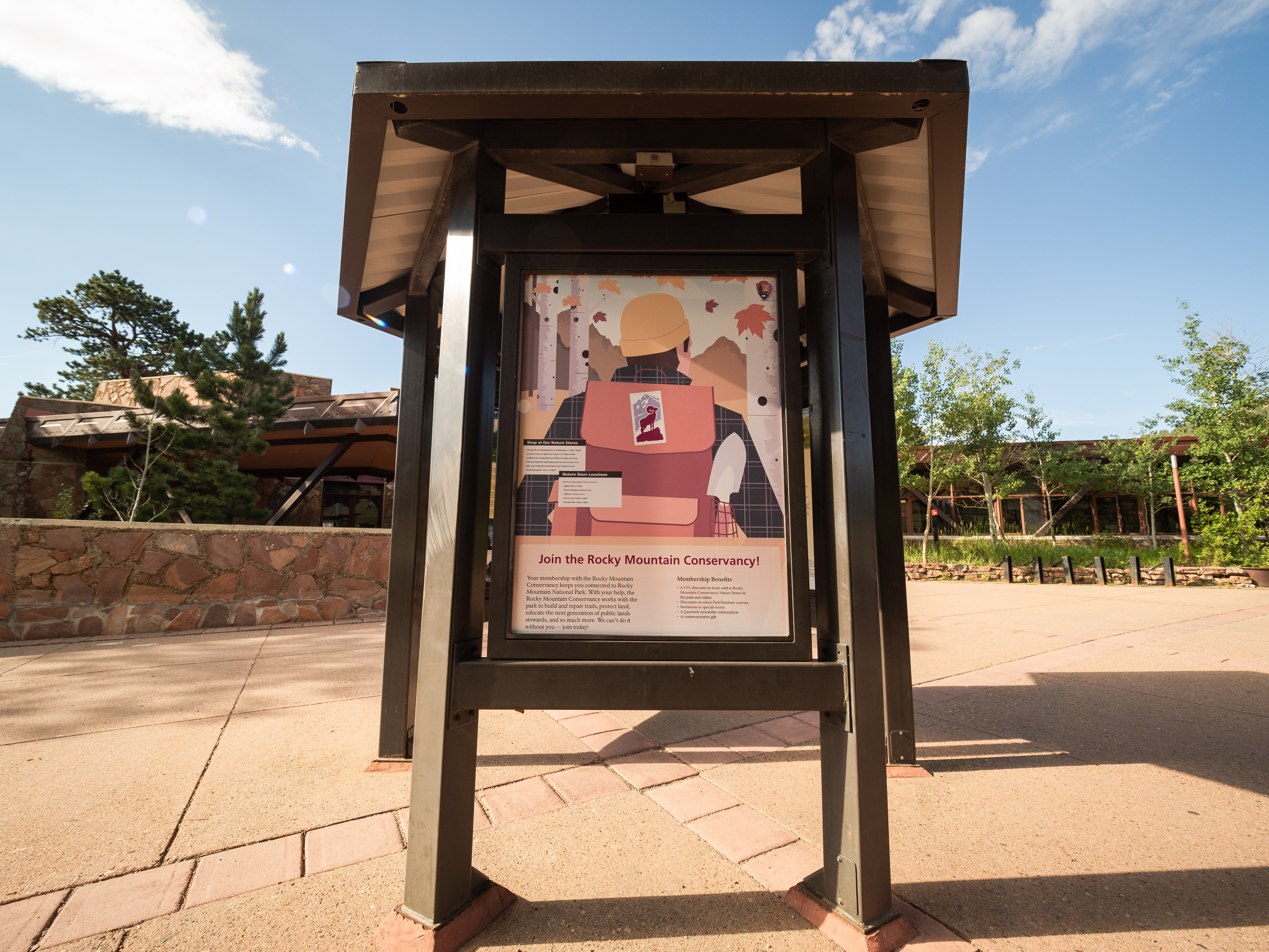

A painting (or Poster?) on the wall is an attitude. It’s like a sign that is hung up to be seen. It says this is the way it is according to a given sensibility—and its beauty, fitness, magnetism or emotion, embraces the viewer (if it does), seduces them—but in a way persuades them that this is a way of viewing what is to be viewed. — Richard Diebenkorn
Schedule
- - - - - - - - - - - - - - - - - - - - - - - - - - - - - - - - - - - - - - - -
Thursday September 22nd
- - - - - - - - - - - - - - - - - - - - - - - - - - - - - - - - - - - - - - - -
Inclass:
Intro to Class/Syllabus & Project One.
Homework:
1. Read the following excerpt from the book Graphic Design Theory about Context. Also watch this show about Paula Scher if you haven’t already.
2. Visit LNT and choose 2 principles you are interested in.
- Plan ahead & prepare.
- Travel & camp on durable surfaces.
- Dispose of waste properly.
- Leave what you find.
- Minimize campfire impacts.
- Respect wildlife.
- Be considerate of others.
3. Before next class answer the following questions for each of your 2 principles. Type set this on an 8.5x11 sheet of paper and print it out:
What is the principle?
What will/could happen if something isn’t done about this?
Who is affected by it?
why is it important to us?
What key words surround this issue?
What needs to be said? (what key messages could you communicate, data, facts…)
What constructive dialogue needs to be promoted?
What assumptions/stereotypes/biases/ideas (good & bad) surround this issue?
How has/is this issue being communicated? (precedent? pictures!)
4. Before next class pick an audience and context. Could be same audience and context for each principle or totally different. Answer the following and type set this on the same 8.5x11 sheet of paper and print it out:
What is their name?
Where are they seeing this poster?
What are they there to do? What activity?
5. Lastly, for each audience, context and principle please create an associative wordlist of adjectives, verbs and nouns that come to mind in that ideaspace. Type set this on a separate 8.5x11 sheet of paper and print it out.
So you should have 4 sheets total.
- - - - - - - - - - - - - - - - - - - - - - - - - - - - - - - - - - - - - - - -
Tuesday Sept 27th
- - - - - - - - - - - - - - - - - - - - - - - - - - - - - - - - - - - - - - - -
Inclass:
Review your choices, wordlists, audiences, contexts & info!
Poster Design Presentation by Jeremy. Visual Rhetorics.
Poster Examples:
Gig Posters
http://graphicadvocacyposters.org/posters/
http://gurafiku.tumblr.com/
http://divergenow.com/the-work/2017/03/eleven-whm17-be-bold-for-change/
https://designobserver.com/feature/signs-signs/39492
http://www.designishistory.com/1850/posters/
https://www.internationalposter.com/a-brief-history-of-the-poster/
https://peoplesgdarchive.org/
Homework:
For Thursday create at least two moodboards that communicate the “goodness of fit between form and context” you are striving for. What do you want these posters to feel like? What personal visual challenge are you interested in exploring? For the boards make them 11x17in and name each board while also including some key words. Frame meaning for us.
Print them out to pin up.
Here are some examples:
Nicely Framed/Named Moodboard
Moodboard with color palette
Good “Named” Moodboards with keywords
Sketches (not great drawer, but ideas communicated) & Moodboards
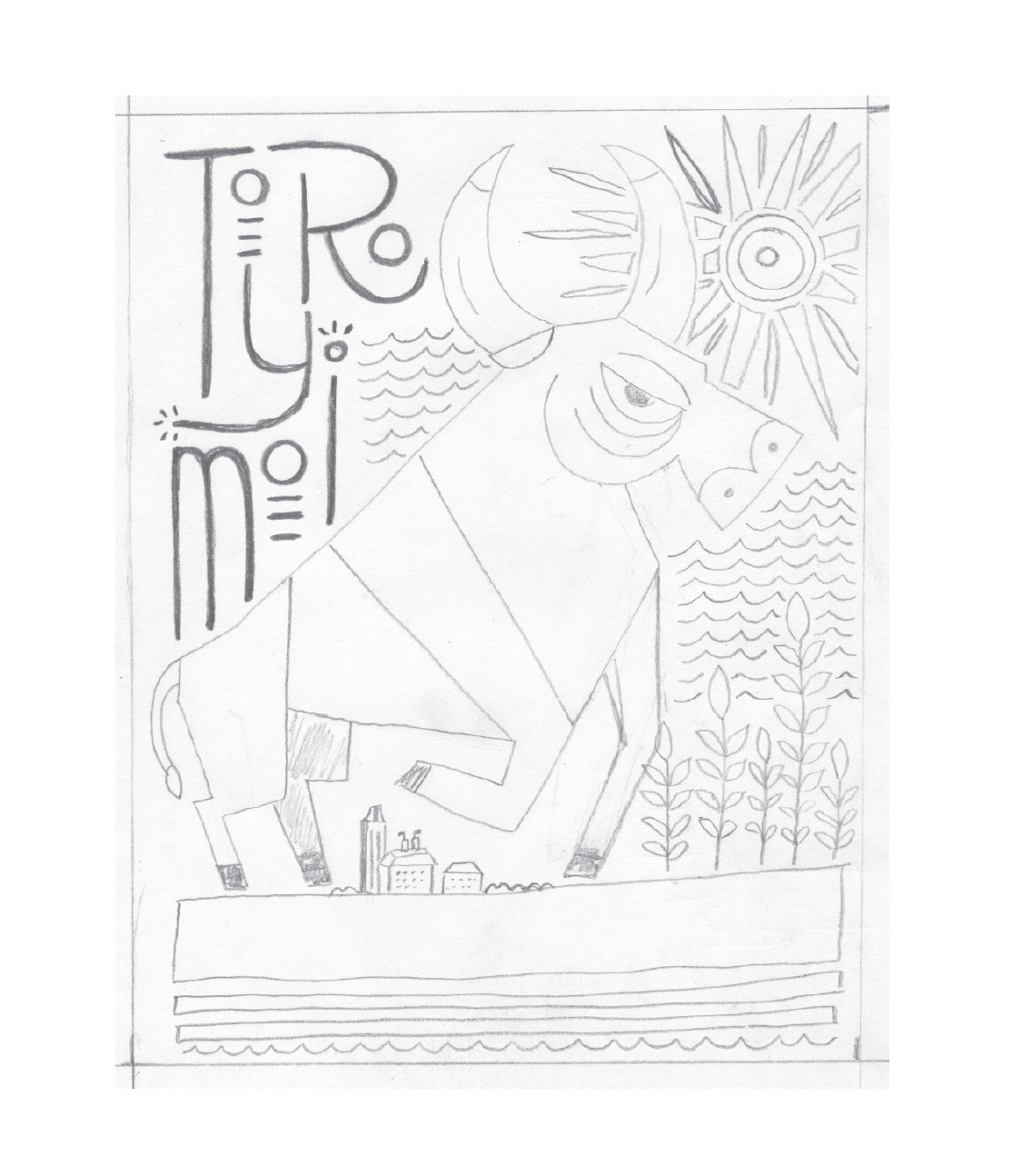
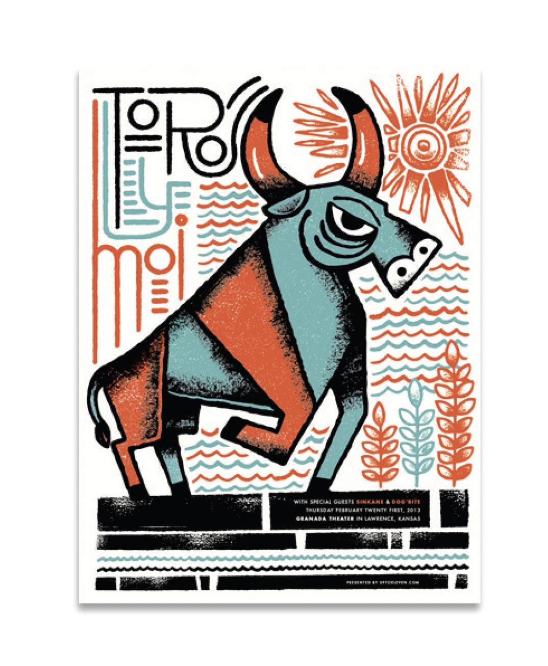
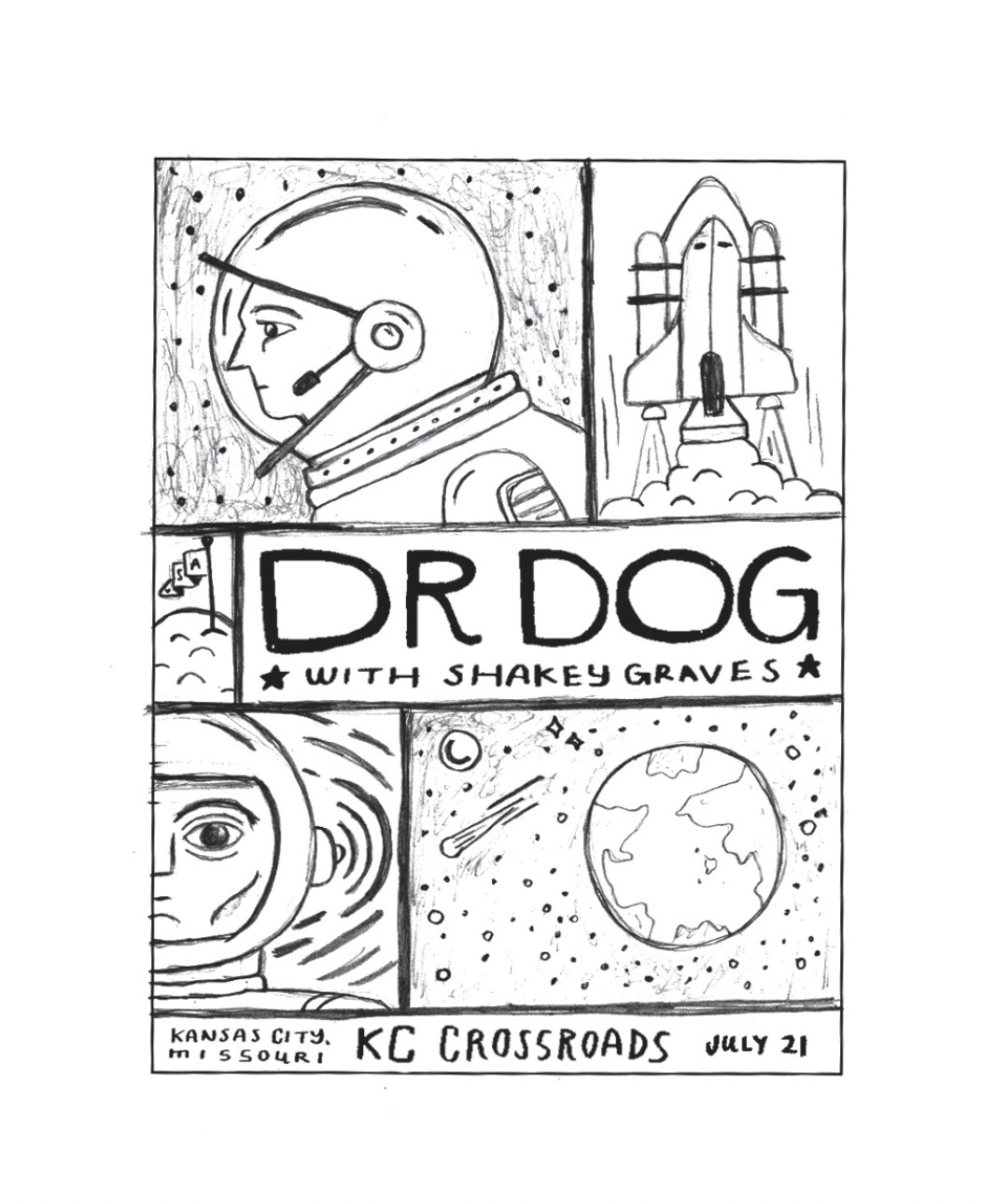

By next Tuesday design atleast 10 poster concept *sketches per principle that meet the key messages stated in your research. Work in 18x24 proportions. Vertical. Pencil sketches are good, but get on computer if that helps or is easier to show concept.
Design one concept that uses Image Alteration to communicate Design one concept that uses Image Combination to communicate Design one concept that uses Simile to communicate Design one concept that uses Metonymy to communicate Design one concept that uses Metaphor to communicate Design one concept that uses Syncdoche to communicate Design one concept that uses Pun to communicate
Design one concept that uses Type As Image to communicate
*sketches can be done however you like, the goal is to explore possibilities, test what might work and be able to communicate those back to us.
While Designing your Concepts try versions that explore these type and image relationships: separation, fusion, fragmentation and inversion.

Image collections:
Flickr Commons
NYPL
Library of Congress
Create a pdf presentation of your concepts to project to the class. Start the presentation with your research and state the key messages you are trying to communicate. Label each concept (Metaphor, Image Alteration...etc). Place pdf on server before class, so we can start right away and get to everyone. Bring on thumbdrive if you have problems getting on the server.
Design this presentation for the screen.
Here is an example: Presentation 1
- - - - - - - - - - - - - - - - - - - - - - - - - - - - - - - - - - - - - - - -
Thursday Sept 29th
- - - - - - - - - - - - - - - - - - - - - - - - - - - - - - - - - - - - - - - -
Worktime & Individual Desk Crits.
Bring what you need to have a working session in class.
- - - - - - - - - - - - - - - - - - - - - - - - - - - - - - - - - - - - - - - -
Tuesday Oct 4th
- - - - - - - - - - - - - - - - - - - - - - - - - - - - - - - - - - - - - - - -
8-10 Advocacy Poster Presentations.
Homework:
Based on class feedback choose 2-3 directions to refine and either translate to digital or if already digital continue with refinements.
Post refinements to MURAL.
- - - - - - - - - - - - - - - - - - - - - - - - - - - - - - - - - - - - - - - -
Thursday Oct 6th
- - - - - - - - - - - - - - - - - - - - - - - - - - - - - - - - - - - - - - - -
Workshop/Blitz with KU Alumni
Homework:
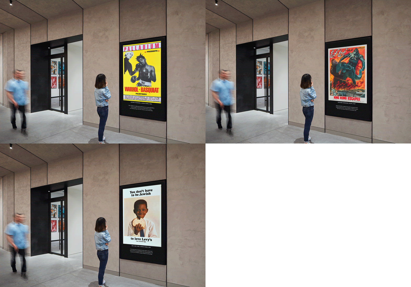 Translate your chosen sketches to the computer and make some tighter comps. Print your 2-3 posters. You may still be deciding between layouts so ok if not totally narrowed down. Tiling your posters is ok, just make sure they are full-size.
Take an image of the posters in a context from 5ft, 20ft and 50ft away to check and see how they read from a distance.
Bring your printed posters. You will pin up in class and we will take a look at them as a group and give feedback!
- - - - - - - - - - - - - - - - - - - - - - - - - - - - - - - - - - - - - - - -
Tuesday Oct 11th
- - - - - - - - - - - - - - - - - - - - - - - - - - - - - - - - - - - - - - - -
No Class Fall Break!
- - - - - - - - - - - - - - - - - - - - - - - - - - - - - - - - - - - - - - - -
Thursday Oct 13th
- - - - - - - - - - - - - - - - - - - - - - - - - - - - - - - - - - - - - - - -
Review final posters and any iterations you are still deciding on.
Homework:
Refinements based on feedback.
- - - - - - - - - - - - - - - - - - - - - - - - - - - - - - - - - - - - - - - -
Tuesday Oct 18th
- - - - - - - - - - - - - - - - - - - - - - - - - - - - - - - - - - - - - - - -
After Effects DEMO & Motion Poster/Graphics Workshop.
Bring all your process work and final poster (raw) files.We will be using your layers and/or process as elements for a motion poster.
Homework: Refinements! Poster(s) Printed (tiled to save some money if you like) and 5-10 sec motion poster draft 1.0
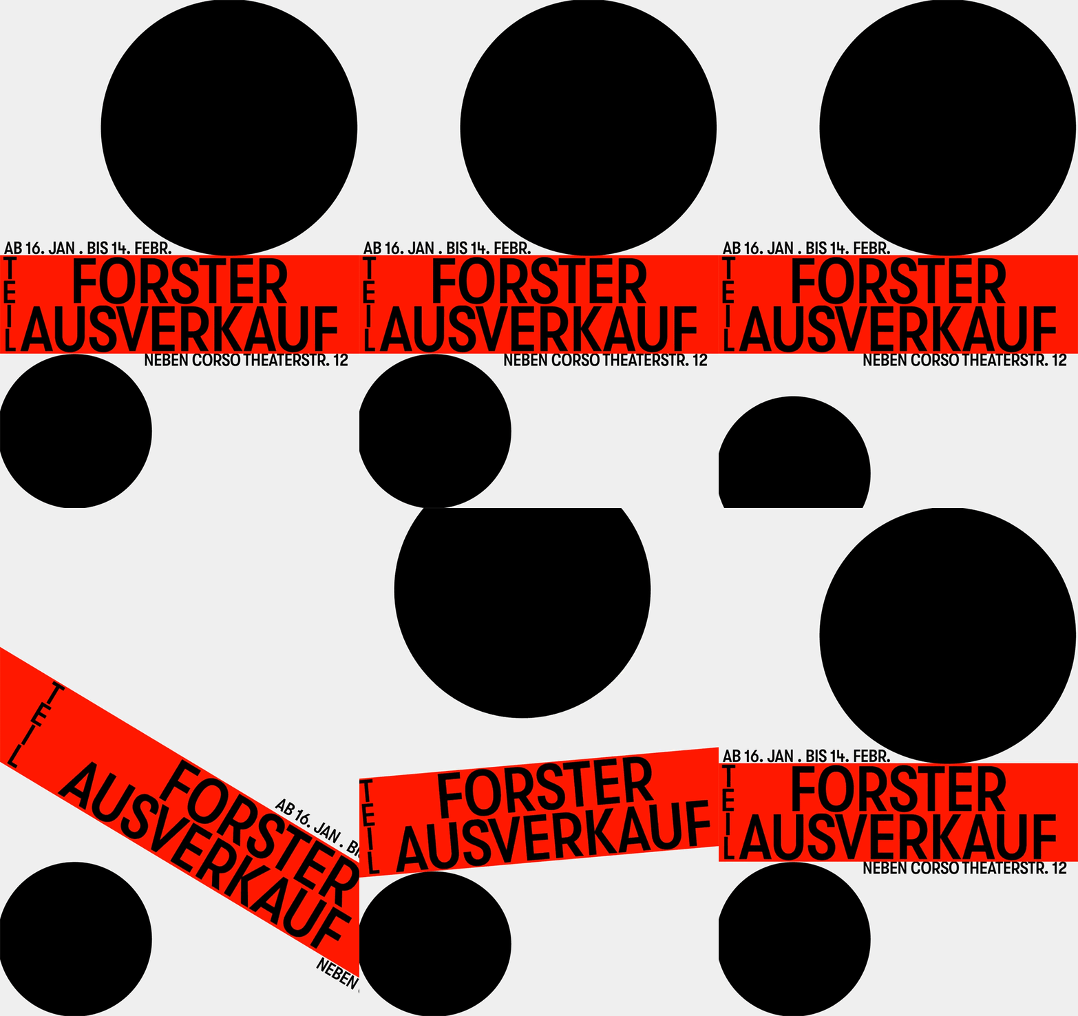
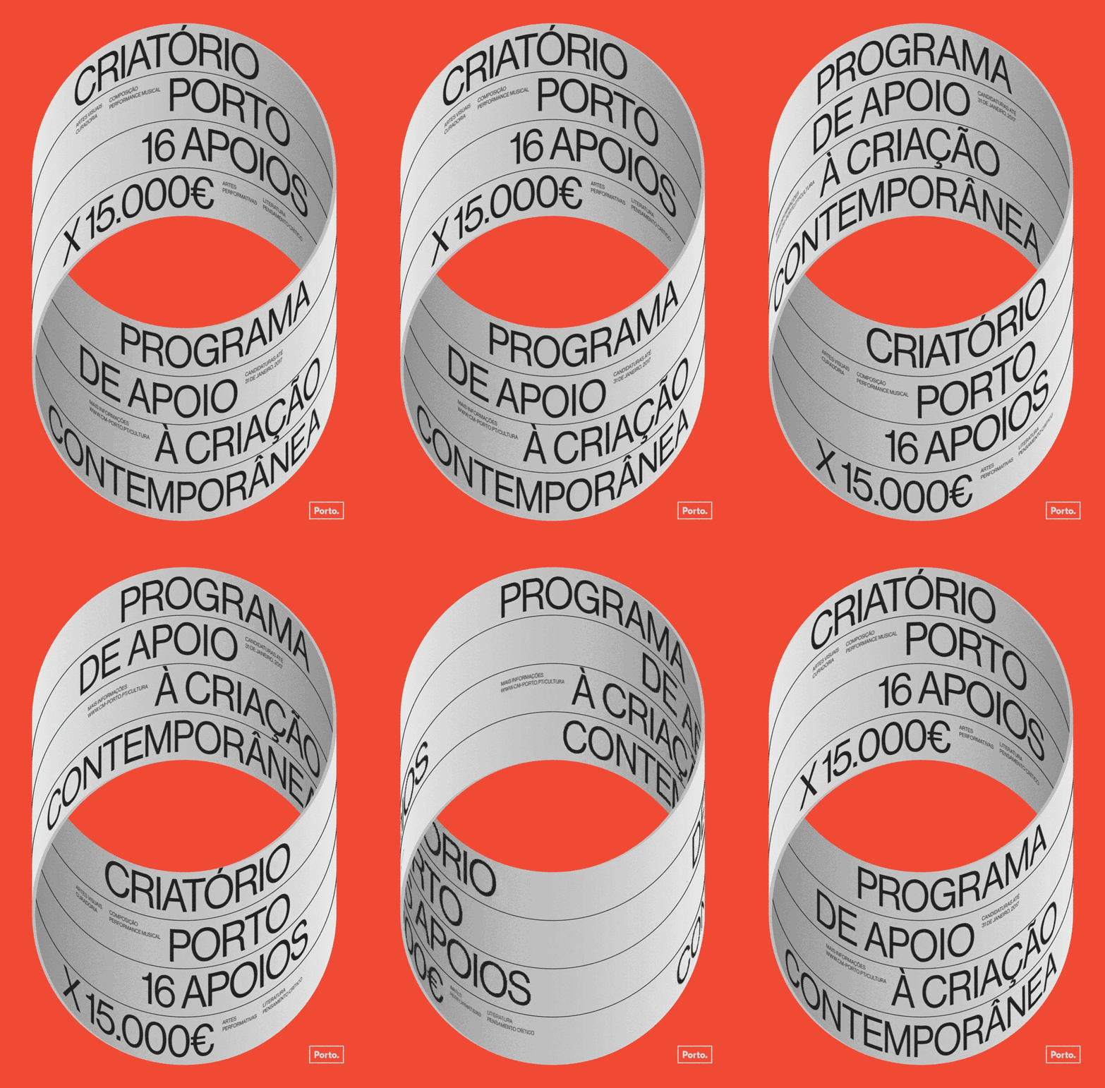

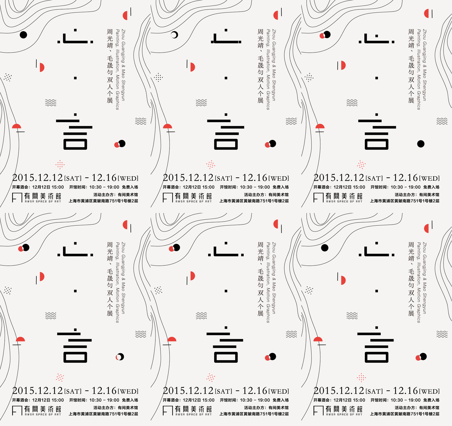
36 Days of Kinetic Type
-
Best Motion Posters
- - - - - - - - - - - - - - - - - - - - - - - - - - - - - - - - - - - - - - - -
Thursday Oct 20th
- - - - - - - - - - - - - - - - - - - - - - - - - - - - - - - - - - - - - - - -
Worktime in AfterEffects and poster refinements.
Jeremy at AIGA Conference
- - - - - - - - - - - - - - - - - - - - - - - - - - - - - - - - - - - - - - - -
Tuesday October 25th
- - - - - - - - - - - - - - - - - - - - - - - - - - - - - - - - - - - - - - - -
Final Check-in on Motion and two posters.
Homework:
Print and export motion graphic to .gif
- - - - - - - - - - - - - - - - - - - - - - - - - - - - - - - - - - - - - - - -
Wednesday October 26th
- - - - - - - - - - - - - - - - - - - - - - - - - - - - - - - - - - - - - - - -
Jeremy available for After Effects help in rm 313 from 9-3pm.
- - - - - - - - - - - - - - - - - - - - - - - - - - - - - - - - - - - - - - - -
Thursday October 27th
- - - - - - - - - - - - - - - - - - - - - - - - - - - - - - - - - - - - - - - -
Check in at beginning of class on any AE troubleshooting, then will switch sections and you will start Alex’s next project.
- - - - - - - - - - - - - - - - - - - - - - - - - - - - - - - - - - - - - - - -
Tuesday October 31st
- - - - - - - - - - - - - - - - - - - - - - - - - - - - - - - - - - - - - - - -
Project Due at beginning of class. Post pdf of posterss and gif to MURAL (no need to sign in, as a “visitor” you can post)